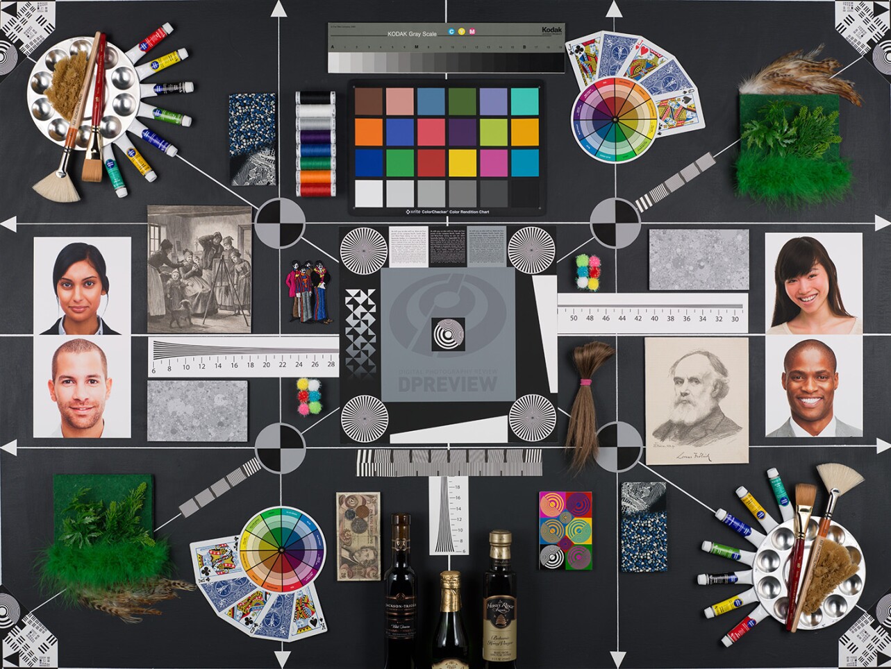
Interactive: The DPReview Test Scene
With each camera they test, the crew at DPReview photographs this chart 100 times using different combinations of camera settings and lighting conditions. “It sounds very technical, but everything exists here to quickly assess some real-world impact of the camera," said DPReview’s Rishi Sanyal in our story about the team behind the respected 19-year-old site. Click the orange camera aperture icons to read Sanyal’s explanation of what each part of chart reveals.
Show Legend
Hide Legend
DPReview
Low-light Paint Tubes
DPReview Interactive
Our low-light scene has only one bulb on the right side, which means the upper-left corner of the studio scene receives very little light. Under low light / high ISO conditions, the amount of noise in the dark black board around the tubes is a good indicator of high ISO dynamic range. Less noise allows you to "rescue" or brighten dark areas of your image without over-emphasizing unpleasant noise.

Converging lines
DPReview Interactive
These converging black and white lines give an idea of how much the camera and lens are resolving together. Find the point where you can no longer reliably distinguish the individual black and white lines, look at the number below it, and multiply by 100. That’s how many lines the camera is resolving across the height of the image. Switching the tool between Raw and JPEG also shows how effectively the camera’s JPEG engine preserves the raw detail captured at the sensor level.

Gretag-Macbeth Chart colors
DPReview Interactive
We use the well-known Gretag-Macbeth Chart to assess pleasing — not necessarily accurate — color. Warm yellows and greens make for pleasing skin tones and foliage, while deep blue patches without much color cast indicate skies will appear pleasing. We look for unpleasing color casts as much as we look for pleasing colors: for example, greener yellows are indicative of poor skin tone rendition, while cyan or magenta casts in blue patches indicate unpleasing sky rendition. Deeper reds are generally also considered pleasing.

High-contrast targets
DPReview Interactive
As light levels drop, on-board noise-reduction engines tend to aggressively remove noise in dark portions of the scene while leaving high-contrast detail alone. Sometimes this causes noise-reduction artifacts around edges of high-contrast targets against a smooth background. The best noise-reduction engines remove noise in the detail-less dark regions of our board while avoiding these artifacts, all the while preserving real detail instead of blurring it.

Bank note
DPReview Interactive
The fine detail in the bank note allows us to judge how well the camera sharpens the Raw capture to produce a final JPEG. Good sharpening engines emphasize the very fine detail (the low-contrast squiggly lines), whereas some cameras throw away this fine detail in order to make the image more "punchy."

Green foliage
DPReview Interactive
The green leaves and foliage let us look at how well similar-colored detail is preserved in our low-light scene as ISO climbs. The best noise-reduction engines are able to reduce noise while still distinguishing and preserving the fine edges of the leaves and the low-contrast green detail behind the leaves.

Text blocks
DPReview Interactive
The more — and smaller — text you can read in the test images on the DPReview site, the higher the resolution of the camera.

Gretag-Macbeth Chart greys
DPReview Interactive
As light levels drop and ISO values climb, noise levels rise. These grey patches on the Gretag-Macbeth Chart give a good idea of how noisy the midtones – like faces in the scene – will appear. For JPEG shooters, they also give an idea of what sort of artifacts less-sophisticated noise reduction can leave behind.

Color resolution targets
DPReview Interactive
Most sensors capture more green – and thus luminance information – than red and blue, so the increasingly fine color details in these patches help assess how well cameras resolve different colors. Cameras with random pixel orientations or those with "Pixel Shift" modes that record every color at every pixel tend to resolve far more color information than cameras without these technologies.

Color wheel
DPReview Interactive
The color wheel is useful for testing noise reduction. More aggressive algorithms will cause similar colors to “bleed” into one another, causing coloration of the black lines dividing the color slices in the wheel.

Dead Leaves patch
DPReview Interactive
This pattern uses a unique set of details that can fool noise-reduction systems into removing details from the pattern. As light levels drop and ISO increases, the best cameras reduce noise while preserving all the patterns. Aggressive, less sophisticated image processing engines smear or remove details from the pattern.

Color threads
DPReview Interactive
These colored threads show how well a camera’s noise-reduction engine retains fine detail in saturated colors as light levels drop.

Newspaper etching
DPReview Interactive
This newspaper etching has a lot of fine detail that is low in contrast. As light levels drop and cameras have to perform more noise reduction, the best ones retain the fine detail without smearing or blurring it. This is a good portion of our scene to look for moire as well – the unpleasant color bands that might appear when shooting a bridal dress, for example.

The Beatles patch
DPReview Interactive
The tightly spaced saturated colors of the Beatles patch are useful for assessing aggressive color noise reduction, which can cause the colors of their threaded clothes to “bleed” into one another in low light or at high ISOs. Also, it's the Beatles.

Low-light Paint Tubes
DPReview Interactive

Our low-light scene has only one bulb on the right side, which means the upper-left corner of the studio scene receives very little light. Under low light / high ISO conditions, the amount of noise in the dark black board around the tubes is a good indicator of high ISO dynamic range. Less noise allows you to "rescue" or brighten dark areas of your image without over-emphasizing unpleasant noise.
Converging lines
DPReview Interactive

These converging black and white lines give an idea of how much the camera and lens are resolving together. Find the point where you can no longer reliably distinguish the individual black and white lines, look at the number below it, and multiply by 100. That’s how many lines the camera is resolving across the height of the image. Switching the tool between Raw and JPEG also shows how effectively the camera’s JPEG engine preserves the raw detail captured at the sensor level.
Gretag-Macbeth Chart colors
DPReview Interactive

We use the well-known Gretag-Macbeth Chart to assess pleasing — not necessarily accurate — color. Warm yellows and greens make for pleasing skin tones and foliage, while deep blue patches without much color cast indicate skies will appear pleasing. We look for unpleasing color casts as much as we look for pleasing colors: for example, greener yellows are indicative of poor skin tone rendition, while cyan or magenta casts in blue patches indicate unpleasing sky rendition. Deeper reds are generally also considered pleasing.
High-contrast targets
DPReview Interactive

As light levels drop, on-board noise-reduction engines tend to aggressively remove noise in dark portions of the scene while leaving high-contrast detail alone. Sometimes this causes noise-reduction artifacts around edges of high-contrast targets against a smooth background. The best noise-reduction engines remove noise in the detail-less dark regions of our board while avoiding these artifacts, all the while preserving real detail instead of blurring it.
Bank note
DPReview Interactive

The fine detail in the bank note allows us to judge how well the camera sharpens the Raw capture to produce a final JPEG. Good sharpening engines emphasize the very fine detail (the low-contrast squiggly lines), whereas some cameras throw away this fine detail in order to make the image more "punchy."
Green foliage
DPReview Interactive

The green leaves and foliage let us look at how well similar-colored detail is preserved in our low-light scene as ISO climbs. The best noise-reduction engines are able to reduce noise while still distinguishing and preserving the fine edges of the leaves and the low-contrast green detail behind the leaves.
Text blocks
DPReview Interactive

The more — and smaller — text you can read in the test images on the DPReview site, the higher the resolution of the camera.
Gretag-Macbeth Chart greys
DPReview Interactive

As light levels drop and ISO values climb, noise levels rise. These grey patches on the Gretag-Macbeth Chart give a good idea of how noisy the midtones – like faces in the scene – will appear. For JPEG shooters, they also give an idea of what sort of artifacts less-sophisticated noise reduction can leave behind.
Color resolution targets
DPReview Interactive

Most sensors capture more green – and thus luminance information – than red and blue, so the increasingly fine color details in these patches help assess how well cameras resolve different colors. Cameras with random pixel orientations or those with "Pixel Shift" modes that record every color at every pixel tend to resolve far more color information than cameras without these technologies.
Color wheel
DPReview Interactive

The color wheel is useful for testing noise reduction. More aggressive algorithms will cause similar colors to “bleed” into one another, causing coloration of the black lines dividing the color slices in the wheel.
Dead Leaves patch
DPReview Interactive

This pattern uses a unique set of details that can fool noise-reduction systems into removing details from the pattern. As light levels drop and ISO increases, the best cameras reduce noise while preserving all the patterns. Aggressive, less sophisticated image processing engines smear or remove details from the pattern.
Color threads
DPReview Interactive

These colored threads show how well a camera’s noise-reduction engine retains fine detail in saturated colors as light levels drop.
Newspaper etching
DPReview Interactive

This newspaper etching has a lot of fine detail that is low in contrast. As light levels drop and cameras have to perform more noise reduction, the best ones retain the fine detail without smearing or blurring it. This is a good portion of our scene to look for moire as well – the unpleasant color bands that might appear when shooting a bridal dress, for example.
The Beatles patch
DPReview Interactive

The tightly spaced saturated colors of the Beatles patch are useful for assessing aggressive color noise reduction, which can cause the colors of their threaded clothes to “bleed” into one another in low light or at high ISOs. Also, it's the Beatles.